Title Spread:

Front Matter:


Chapter Openers:


Sample Spreads:


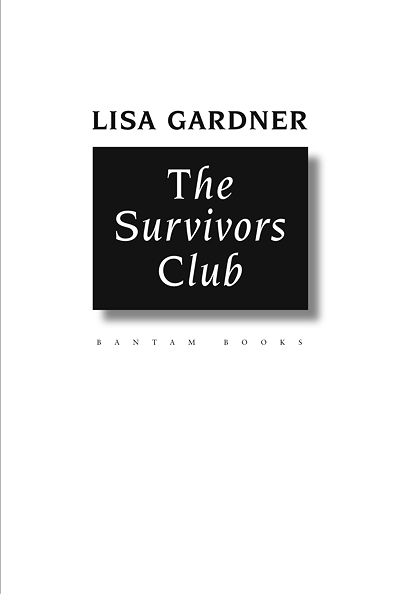
The challenge with thrillers like The Survivors Club is to find a way for the design to subtly bolster the tension of the story without drawing attention to itself. For this project I chose a display font that is a bit angular, and, more importantly, has roman caps to go along with its lower case italics. While that combination is historically accurate—the earliest italic fonts did have roman caps—we are unused to seeing the two together today, and I felt the font would bring a subconscious tension to the reader.
As it happens, the combination made either the author or editor uncomfortable as well (I never did find out which), and the display font was replaced with a similar, all italic, font in the final book, as you can see in the page previews for the title on Amazon.