Title Spread:

Front Matter:


Chapter Opener:

Intro Spreads:


Color Insert Spreads:


Recipe Spreads:


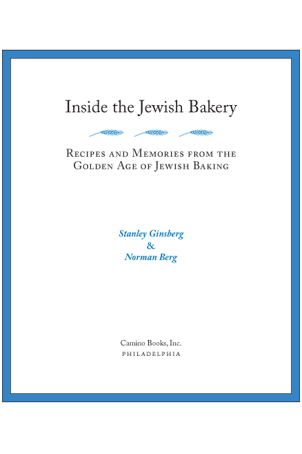
This wonderful cookbook is also a great history of the Jewish bakery, and I wanted to give it a design that reflected both the present and the past. To do that, I chose a classic typeface, and gave the photos in the body of the book a white frame, such as you find on older photos–but gave the frame a thin blue border (reversed on the title page), and kept the lines and the presentation clean and open.
Since most of the illustrative and historical photos were black-and-white, the publisher decided to go with two-color for the body of the book, and keep the color photos taken by the recipe-testers to three full-color inserts. I chose blue as the second color not only because it leaps to mind when doing a Jewish-themed book, but also because this shade of blue screens back well and provides a good background for baked goods (as you can see in the 4-color sections), and because the blue-and-white combination suits the clean look I was going for.
The book is available on Amazon and on the authors’ website. Sadly, neither Amazon nor the author’s site has a preview of the book interior, although the author’s site used to.