
Title Spread:
Front Matter:
Chapter Opener:
Sample Spreads:
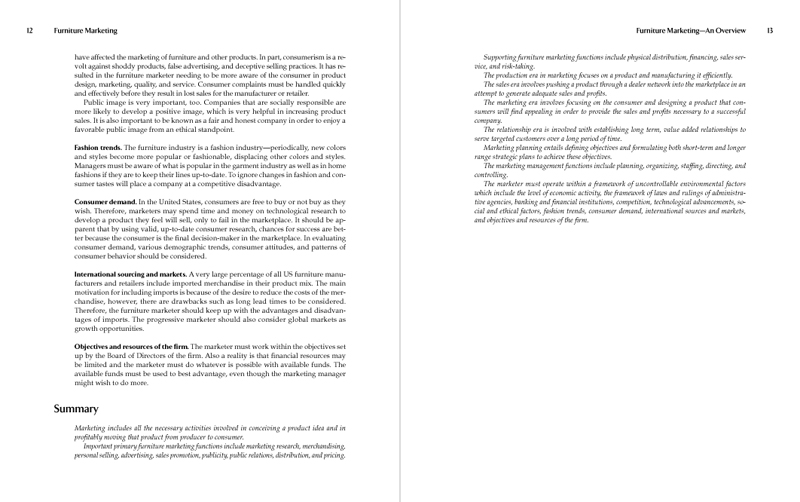
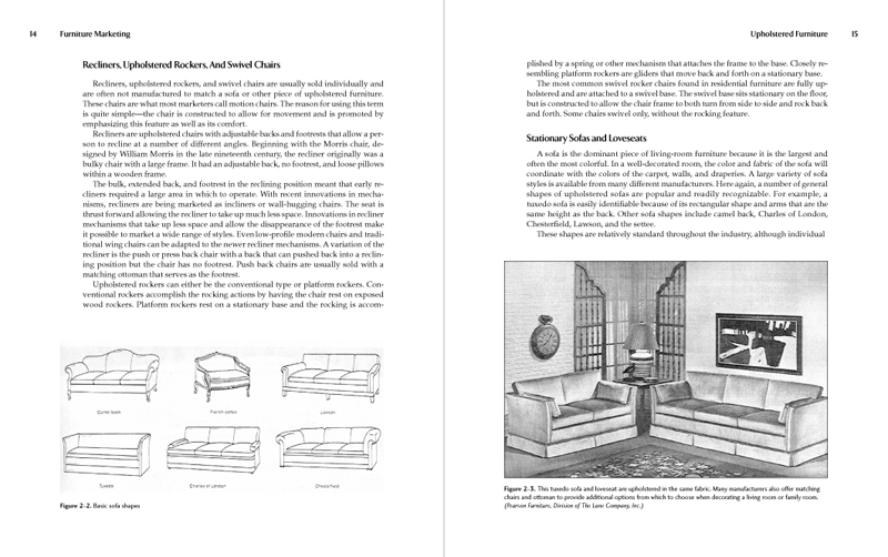
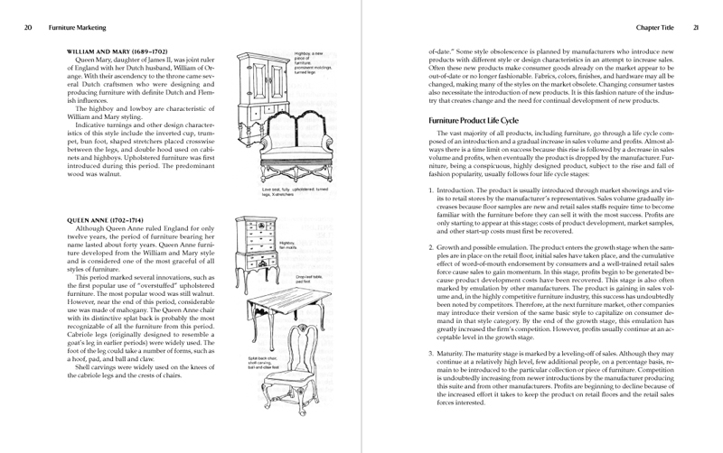
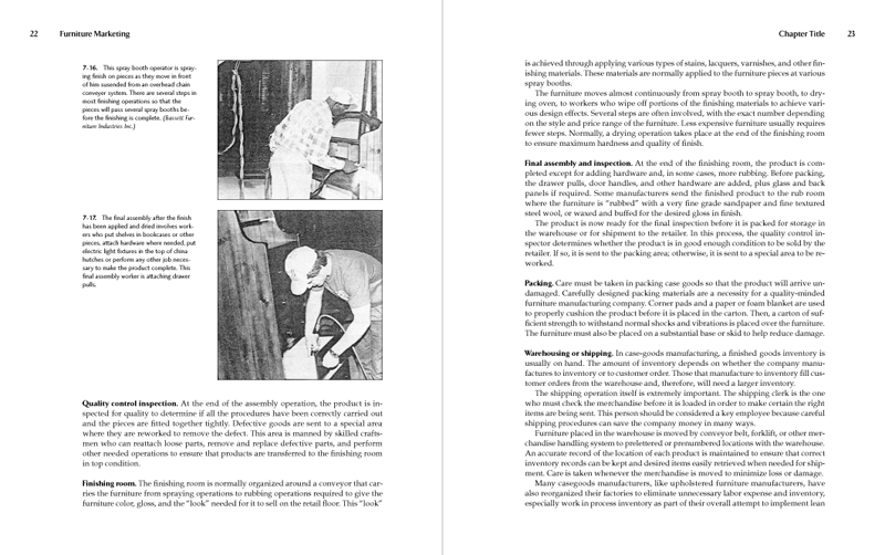
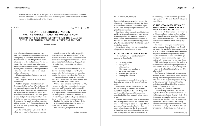
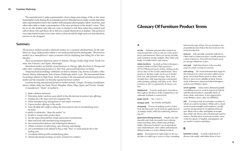
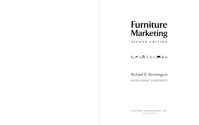
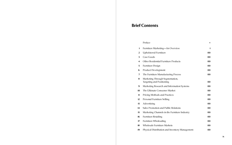
Since the subject of this textbook–furniture marketing–has a large visual component, I decided to amplify that by using a row of small furniture images on the title page, chapter openers, and on the top edge of boxes. The use of the little furniture parade on the boxes, by the way, is not just for “cute”–it signals the beginning of a box, to that one can tell at a glance whether a box is continuing on from an earlier page or not. So, useful and fun!
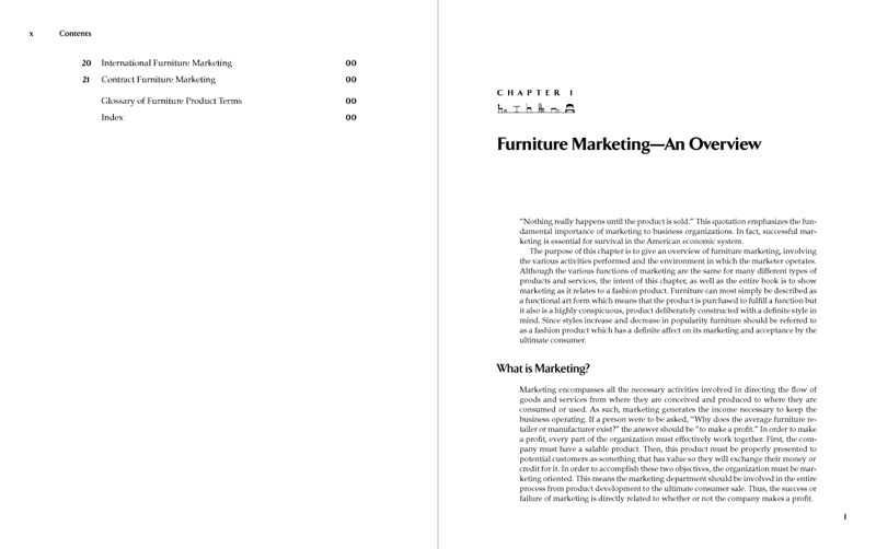
Of course, the book contains standard textbook elements–multiple levels of heads, lists, figures, boxes, illustrations, and so on, all of which needed to be both clearly distinguished from each other and to have their relationships clearly indicated, which is always the trick with textbooks. Since the book had a fairly large trim, I was able to outdent the A heads, which served to clearly mark the major chapter subdivisions, to give the body text a more comfortable reading length, and to still allow plenty of room for images and figures.
The book is available on Amazon, although without page previews.